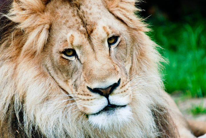
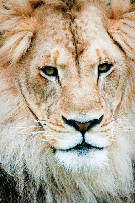
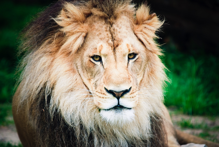
In The Jungle… {Please Vote!}

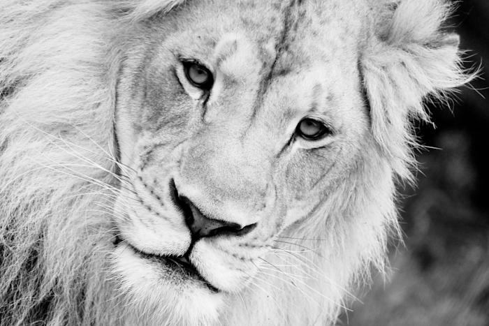
Hey Everyone!  Can you help me out?  I am tossing around the idea of entering a photo into a contest at the Little Rock Zoo but I can’t decide which lion photo is my favorite.  They are all the same photo, but edited differently.  Do you think one shouts “winner?”  Thank you for voting and have a great day!!!
Ashley Lyon - March 23, 2011 - 1:06 pm

I love the B&W one, but can you do that angle in color? I think that would be my fav. Poor lion looks sad.

Amber - March 23, 2011 - 2:05 pm

I love the second one! I like that you can see the grass but that his face is still up front and center! Gods creatures are so amazing!!

Betty downs - March 23, 2011 - 4:52 pm

I like #2. And all of Sean’s photos!

Heather - March 23, 2011 - 4:52 pm

I like the second one. The green grass really shows off his beauty.

cassie - March 23, 2011 - 5:36 pm

#2 for sure!

Cari Burnett - March 23, 2011 - 9:59 pm

I like the second one!

Susan Wilkinson - March 23, 2011 - 11:58 pm

I like #1. He has that “Old Man” Lion look. Full of wisdom. Ancient. He just speaks to me.

Vanessa - March 24, 2011 - 1:55 am

I love the last one!

Amelia - March 24, 2011 - 2:16 am

I like the first one.

Scott likes the last one.

Debra - March 24, 2011 - 1:58 pm

After much, much, MUCH deliberation
my order of preference is:
3,1,2
or….1,3,2
Oh Shoot! Guess I didn’t delierate long enough!!!
I guess my only positive is 4 is not my favorite.
Great photography!
mom

Bugs & Sunshine - March 24, 2011 - 5:08 pm

first one, but they are all amazing!

Leslie - March 24, 2011 - 8:00 pm

I like the angle of number 2. I also like the first one in B&W, but something about #2 draws me in.=)

Lori Weir - March 25, 2011 - 4:51 pm

#1–Awesome!!

Betty Sargent - March 26, 2011 - 1:52 pm

The first one you can see the wisdom/care in his eyes-thus the is lion, the second one (color) is beautiful, and I agree its more sad, just because he’s the “King of the Jungle” isn’t always a favored spot, sometimes leadership brings loneliness! Just my thoughts-good luck!

kim - March 27, 2011 - 12:18 am

That’s a hard one. I think I like the last one best.

Brittney - March 28, 2011 - 7:02 pm

I love the last one where you can see more of his body, but my vote has to go to #2…such a great pic!!

Katy Kellar - March 30, 2011 - 7:51 pm

I like the third picture — there is just something about it. As always, everytime I visit your site I am amazed at how wonderful everything I see is. One day, I’ll be able to find time to make an appointment.

Your email is never published or shared. Required fields are marked *

*

*

There was an error submitting your comment. Please try again.